Is Civ 7's UI as Bad as They Say?

Is Civilization VII's UI as Bad as Advertised? A Critical Analysis

Civilization VII's Deluxe Edition launched recently, and online discussions are rife with criticism of its user interface (UI) and other shortcomings. But is the UI truly that deficient? This analysis dissects the game's UI elements to determine if the internet's assessment is justified.
← Return to Sid Meier's Civilization VII main article
The UI Under Scrutiny
Early impressions of Civ VII, particularly regarding its UI, have been largely negative. While it's easy to join the chorus of criticism, a more objective evaluation is necessary. We'll examine the UI's components against the standards of a well-designed 4X game interface.
Evaluating a Successful 4X UI
Defining an objectively "good" 4X UI is complex. Design effectiveness depends on the game's context, style, and goals. However, established UI design principles offer common benchmarks for evaluating 4X interfaces. Let's assess Civ VII against these key elements:
Information Hierarchy Clarity
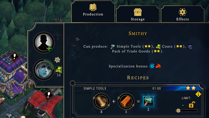
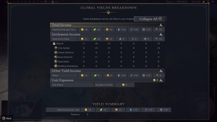
A clear information hierarchy prioritizes accessibility and relevance. Essential resources and mechanics should be prominent, while less crucial features remain easily accessible. The UI shouldn't display everything at once, but it should organize information logically.
Against the Storm's building information menus exemplify this well. Right-clicking a building reveals a multi-tabbed menu, prioritizing common actions in the default tab and relegating less frequent functions to subsequent tabs.
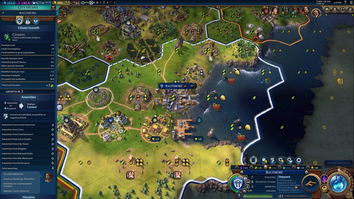
Civ VII's resource summary menu displays resource allocation, separating income, yields, and expenses. While the tabular format is efficient and collapsible, it lacks granular detail. It shows resource origins from rural districts but doesn't specify the exact district or hex. Expense breakdowns are also limited. Therefore, while functional, the UI could benefit from increased specificity.
Effective Visual Indicators
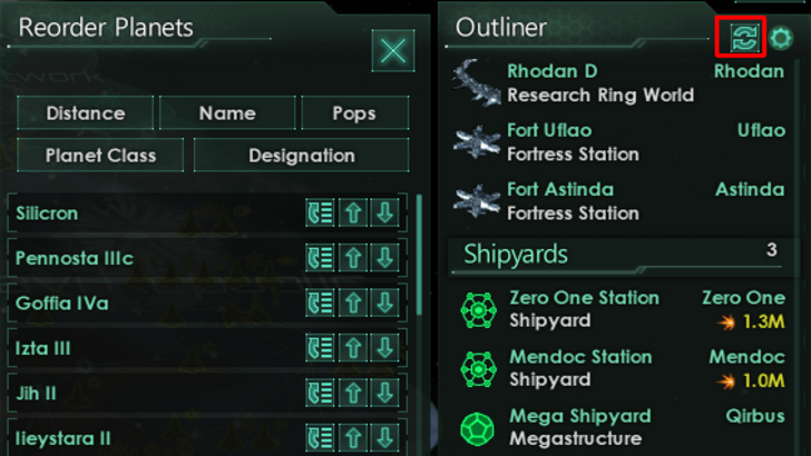
Visual indicators (icons, colors, overlays) should convey information quickly and intuitively. Stellaris' Outliner, despite its cluttered UI, effectively uses visual indicators to show ship status and colony needs.
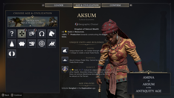
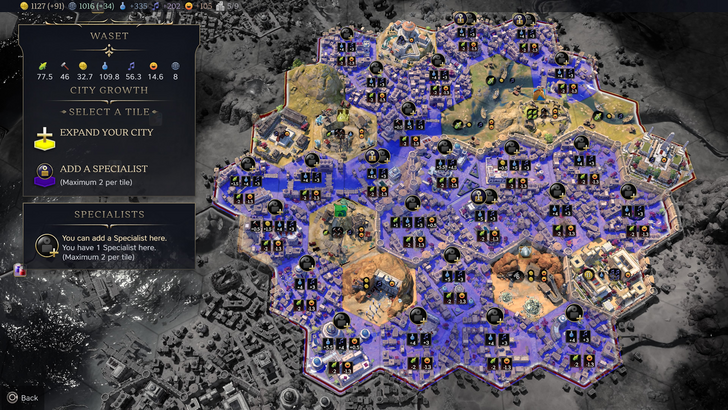
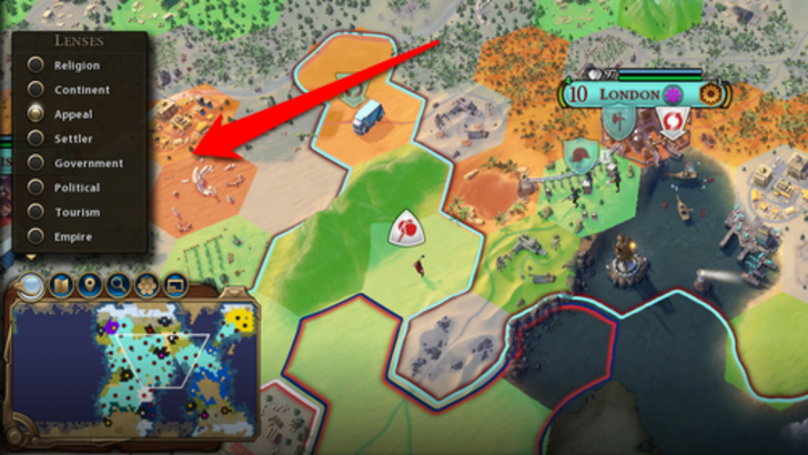
Civ VII utilizes iconography and numerical data. The tile yield overlay, settlement overlay, and settlement expansion screen are effective. However, the absence of certain lenses present in Civ VI (appeal, tourism, loyalty) and the lack of customizable map pins are significant drawbacks. While not disastrous, improvement is needed.
Search, Filtering, and Sorting
As complexity increases, search, filtering, and sorting become crucial. Civ VI's robust search function allows players to locate resources, units, and features easily. Its Civilopedia also seamlessly links entries to in-game elements.
Civ VII's lack of a comparable search function is a major deficiency, significantly impacting usability. This absence is a considerable drawback, especially given the game's scale. Hopefully, this will be addressed in future updates.
Design and Visual Consistency
UI aesthetics and cohesiveness are vital. Civ VI's dynamic, cartographic style integrates seamlessly with its overall aesthetic.
Civ VII adopts a minimalist, sleek design. While not unattractive, its subtle thematic direction lacks the immediate clarity of Civ VI. This has resulted in mixed player reactions, highlighting the subjective nature of visual design.
The Verdict: Not as Bad as the Hype Suggests

Civ VII's UI, while not perfect, isn't as terrible as many claim. The absence of a search function is a significant flaw, but not game-breaking. Compared to other issues, the UI's shortcomings are relatively minor. While it falls short of some competitors' visually striking and efficient UIs, it possesses strengths. With updates and player feedback, it can improve significantly. The overall game's strengths compensate for the UI's imperfections.
← Return to Sid Meier's Civilization VII main article
Similar Games

-
 Hawaiian language packDive into the richness of Hawaiian culture with the Hawaiian language pack app. Install it alongside AnySoftKeyboard to unlock a dedicated Hawaiian keyboard, bringing a tropical vibe to every keystroke. While a built-in dictionary isn't included, yo
 -
 Virtual DroidExperience joy through a virtual android, now enhanced with AI.Welcome to Virtual Droid – your gateway to a virtual metaverse, now featuring AI-powered Bots.- AI-powered bots deliver real-time responses—don't miss the chance to try it yourself.- Disc
 -
 Back WarsJourney a millennium back in time to conquer the world before history unfolds!When a modern army travels a thousand years into the past to dominate the world ahead of schedule, they find their primitive adversaries are full of surprises! Lead a globa
 -
 Fish.IO - Hungry FishRule the Aquarium as Fish King!Enter the narwhal war to become the ultimate Fish King and triumph in fierce aquatic competitions. Dive into Fish.io - Hungry Fish, a thrilling free-to-play io game where you control a deadly baby shark armed with razor
 -
 Campercontact - Camper VanDiscover the perfect travel companion for camper van enthusiasts with Campercontact - Camper Van! Access an extensive database of 50,000+ locations across 58 countries to easily find your next motorhome spot or plan your route. Whether you’re an exp
 -
 Huge Timer Stopwatch TabataMeet your ultimate timing companion: Huge Timer Stopwatch Tabata. Designed to handle all your timing tasks, from workouts and cooking to focused study sessions, this digital app masterfully combines a stopwatch and timer into one intuitive interface